1. CSS Transform
- 2차원 좌표에서 요소를 변형시키는 속성
- translate: 이동
- rotate: 회전
- scale: 확대, 축소
- skew: 경사, 비틀기
- Transform _ 적용예시
|
<head> <style> p {
margin: 0 auto;
width: 600px;
padding: 20px;
border: 3px solid rgba(0, 0, 0, 0.5);
}
#translate {
transform: translate(30px, 50px);
background-color: deeppink;
}
#rotate {
transform: rotate(60deg);
background-color: gold;
}
#scale {
transform: scale(1.5, 1.2);
background-color: orange;
}
#skew {
transform: skew(30deg, 15deg); /* x축의 기울기 각도, y축의 기울기 각도 */
background-color: yellowgreen;
}
</style>
</head> <body>
<h2>transform</h2>
<p>original</p>
<p id="translate">translate</p>
<p id="rotate">rotate</p>
<p id="scale">scale</p>
<p id="skew">skew</p>
</body>
|
 |
"linear-gradient" | Can I use... Support tables for HTML5, CSS3, etc
CSS Repeating Gradients Method of defining a repeating linear or radial color gradient as a CSS image.
caniuse.com
- 벤더 프리픽스(Vender Prefix)
- W3C CSS 권고안에 포함되지 않은 기능이나, 포함되어 있지만 아직 완벽하게 제정된 사태가 아닌 기능을 사용할 때 붙임
- 주요 웹 브라우저 공급자가 새로운 실헙적인 기능을 제공할 때 이전 버전의 웹 브라우저에 그 사실을 알리지 위해 사용하는 접두사
- 해당 속성이 적용되지 않았을 경우 표현해야 할 코드를 가장 먼저 작성해야 하며, 표준 문법 코드는 가장 마지막에 작성해야 함
- -webkit- : 크룸, 엣지를 위한 접두사
- -o- : 오페라를 위한 접두사
- -ms- : 익스플로러를 뤼한 접두사
- -mox- : 파이어폭스를 위한 접두사
- 밴더 프리픽스 _ 적용예시
|
<head> <style> h2 {
margin: 100px;
}
p {
margin: 30px auto;
width: 600px;
padding: 20px;
border: 3px solid rgba(0, 0, 0, 0.5);
}
#gradient {
/*불가능한 사이트에서 표시할 코드*/
background-color: pink;
/*크롬, 엣지를 위한 코드*/
background: -webkit-linear-gradient(left, pink, gray);
/*오페라를 위한 코드*/
background-color: -o-linear-gradient(left, pink, gray);
/*익스플로러를 위한 코드*/
background-color: -ms-linear-gradient(left, pink, gray);
/*파이어폭스를 위한 코드*/
background-color: -moz-linear-gradient(left, pink, gray);
/*CSS 표준 문법 코드*/
background-color: linear-gradient(left, pink, gray);
}
</style>
</head> <body>
<h2>transform</h2>
<p>original</p>
<p id="gradient">gradient</p>
</body>
|
 |
2. CSS Transition
- 요소의 추가할 css 스타일 전환효과를 설정
- property: 요소에 추가할 전환 효과를 설정
- timing-function: 전환효과이 값을 설정
- linear : 처음부터 끝까지 일정한 속도
- ease, ... : 전환효과가 천천히 -> 빨라지고 -> 천천히 -> 끝 - duration: 전환 효과를 나타내는 시간을 설정
- delay: 설정한 시간만큼 대기하다 전황효과를 나타냄
- Transition _ 적용예시(1)
|
<head> <style> div{
width: 100px;
height: 100px;
float: left;
margin: 30px;
}
#bg-tr{
background-color: gold;
transition: background-color ease 2s;
}
#bg-tr:hover{
background-color: red;
}
#border-tr {
background-color: deeppink;
border: 3px dotted black;
transition: all linear 2s;
}
#border-tr:hover {
background-color: pink;
border: 3px dotted gray;
border-radius: 50%;
}
</style>
</head> <body>
<h2>transition1</h2>
<div id="bg-tr"></div>
<div id="border-tr"></div>
</body>
|
(기본)  (왼쪽 hover)  (오른쪽 hover)  |
- Transition _ 적용예시(2)
|
<head> <style> h2 { text-align: center; }
#ex {
position: relative;
width: 800px;
height: 400px;
margin: 0 auto;
border: 5px solid black;
padding: 30px;
}
p {
text-align: center;
padding-top: 50px;
font-weight: bold;
}
.box {
font-size: 20px;
position: relative;
width: 140px;
height: 140px;
margin-bottom: 50px;
background-color: gold;
}
#ex:hover > .box {
transform: rotate(720deg);
margin-left: 650px;
}
#no-delay {
transition-duration: 3s;
}
#delay {
transition-delay: 1s;
transition-duration: 2s;
}
</style>
</head> <body>
<h2>transition2</h2>
<div id="ex">
<div id="no-delay" class="box">
<p>(●'◡'●)</p>
</div>
<div id="delay" class="box">
<p>(⊙_⊙;)</p>
</div>
</div>
</body>
|
hover 했을 때 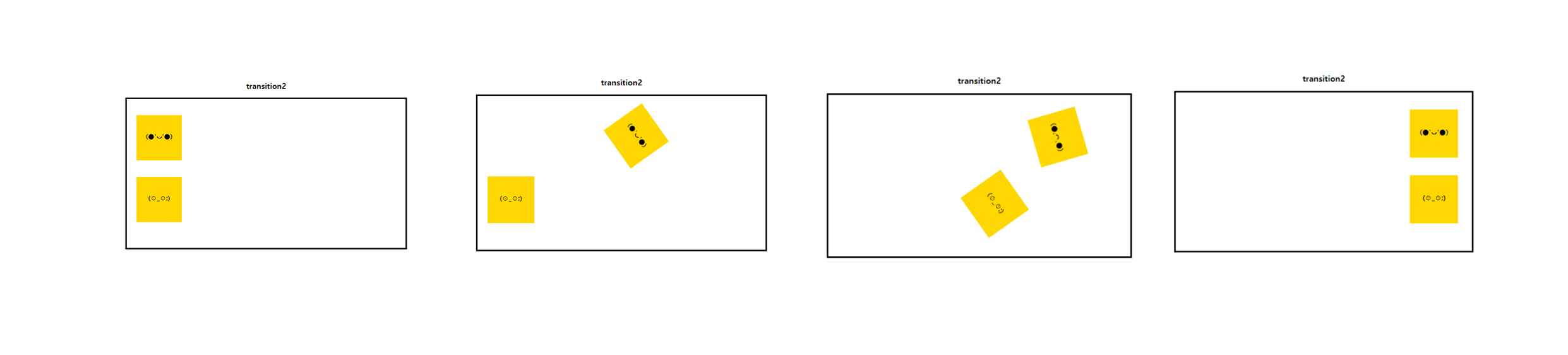 hover 풀었을 때 (다시 돌아감)  |
3. CSS Animation
요소의 현재 스타일을 다른 스타일로 전환
- animation-name: 애니메이션의 이름을 설정
- animation-fill-mode: 애니메이션이 끝난 후 어떻게 퍼리할지 설정
- forwards: 애니메이션 키츠레임이 완료 되었을 떄 마지막 프레임을 유지
- animation-direction: 애니메이션의 진행 방향을 정하는 속성
- reverse: 반대 순서로 진행
- alternate: 전해진 순서로 진행 했다가 다시 반대 순서로 진행
- reverse-alternate: 반대 순서로 진행 했다가 다시 정해진 순서로 진행
- animation-duration: 애니메이션의 일어나는 시간을 설정
- animation-iteration-count: 애니메이션이 몇 번 반복할 지 설정
- infinite: 무한 반복
- 숫자: 해당 숫자만큼 반복

- Animation 적용예시(1)
|
<head> <style> .box{
margin-top: 100px;
margin-left: 100px;
padding: 20px;
height: 60px;
animation-name: moving;
animation-duration: 3s;
animation-iteration-count: infinite;
animation-direction: alternate;
}
@keyframes moving {
from{
width: 200px;
background-color: gold;
opacity: 0.5s;
transform: rotate(0deg);
}
to {
width: 400px;
background-color: pink;
opacity: 1;
transform: rotate(360deg);
}
}
</style>
</head> <body>
<h2>animation1</h2>
<div class="box">
<h3>CSS3 Animation</h3>
</div>
</body>
|
 |
- Animation 적용예시(2)
더보기
<style>
</head>
<head>
<style>
.container{
text-align: center;
background-color: #e74c3c;
overflow: hidden;
}
.box:nth-child(2n-1){
background-color: rgba(0,0,0,0.05);
}
.box{
display: inline-block;
height: 200px;
width: 33.3%;
float: left;
position: relative;
/*margin:0 -4px -5px -2px;*/
transition: all .2s ease;
}
.box p{
color: #777;
font-family: Lato,"Helvetica Neue" ;
font-weight: 300;
position: absolute;
font-size: 20px;
width: 100%;
height: 25px;
text-align: center;
bottom: 0px;
margin: 0;
top:160px;
background-color: #fff;
opacity: 0;
text-transform: uppercase;
transition: all .2s ease;
}
.box:hover p{
bottom:0px;
top:175px;
opacity: 1;
transition: all .2s ease;
z-index: 2;
}
@media (max-width: 700px){
.box{
width: 50%;
}
.box:nth-child(2n-1){
background-color: inherit;
}
.box:nth-child(4n),.box:nth-child(4n-3) {
background-color: rgba(0,0,0,0.05);
}
}
@media (max-width: 420px){
.box{
width: 100%;
}
.box:nth-child(4n),.box:nth-child(4n-3){
background-color: inherit;
}
.box:nth-child(2n-1){
background-color:rgba(0,0,0,0.05);
}
}
.clock{
border-radius: 60px;
border: 3px solid #fff;
height: 80px;
width: 80px;
position: relative;
top: 28%;
top: -webkit-calc(50% - 43px);
top: calc(50% - 43px);
left: 35%;
left: -webkit-calc(50% - 43px);
left: calc(50% - 43px);
}
.clock:after{
content: "";
position: absolute;
background-color: #fff;
top:2px;
left: 48%;
height: 38px;
width: 4px;
border-radius: 5px;
-webkit-transform-origin: 50% 97%;
transform-origin: 50% 97%;
-webkit-animation: grdAiguille 2s linear infinite;
animation: grdAiguille 2s linear infinite;
}
@-webkit-keyframes grdAiguille{
0%{-webkit-transform:rotate(0deg);}
100%{-webkit-transform:rotate(360deg);}
}
@keyframes grdAiguille{
0%{transform:rotate(0deg);}
100%{transform:rotate(360deg);}
}
.clock:before{
content: "";
position: absolute;
background-color: #fff;
top:6px;
left: 48%;
height: 35px;
width: 4px;
border-radius: 5px;
-webkit-transform-origin: 50% 94%;
transform-origin: 50% 94%;
-webkit-animation: ptAiguille 12s linear infinite;
animation: ptAiguille 12s linear infinite;
}
@-webkit-keyframes ptAiguille{
0%{-webkit-transform:rotate(0deg);}
100%{-webkit-transform:rotate(360deg);}
}
@keyframes ptAiguille{
0%{transform:rotate(0deg);}
100%{transform:rotate(360deg);}
}
/* -------------- Sablier -------------- */
.hourglass{
position: relative;
height: 80px;
width: 80px;
top: 28%;
top: -webkit-calc(50% - 43px);
top: calc(50% - 43px);
left: 35%;
left: -webkit-calc(50% - 43px);
left: calc(50% - 43px);
border: 3px solid #fff;
border-radius: 80px;
-webkit-transform-origin: 50% 50%;
transform-origin: 50% 50%;
-webkit-animation: hourglass 2s ease-in-out infinite;
animation: hourglass 2s ease-in-out infinite;
}
.hourglass:before{
content: "";
position: absolute;
top:8px;
left: 18px;
width: 0px;
height: 0px;
border-style: solid;
border-width: 37px 22px 0 22px;
border-color: #fff transparent transparent transparent;
}
.hourglass:after{
content: "";
position: absolute;
top: 35px;
left: 18px;
width: 0px;
height: 0px;
border-style: solid;
border-width: 0 22px 37px 22px;
border-color: transparent transparent #fff transparent;
}
@-webkit-keyframes hourglass{
0%{-webkit-transform:rotate(0deg);}
100%{-webkit-transform:rotate(180deg);}
}
@keyframes hourglass{
0%{transform:rotate(0deg);}
100%{transform:rotate(180deg);}
}
/* -------------- Loader1 -------------- */
.loader1{
position: relative;
height: 80px;
width: 80px;
border-radius: 80px;
border: 3px solid rgba(255,255,255, .7);
top: 28%;
top: -webkit-calc(50% - 43px);
top: calc(50% - 43px);
left: 35%;
left: -webkit-calc(50% - 43px);
left: calc(50% - 43px);
-webkit-transform-origin: 50% 50%;
transform-origin: 50% 50%;
-webkit-animation: loader1 3s linear infinite;
animation: loader1 3s linear infinite;
}
.loader1:after{
content: "";
position: absolute;
top: -5px;
left: 20px;
width: 11px;
height: 11px;
border-radius: 10px;
background-color: #fff;
}
@-webkit-keyframes loader1{
0%{-webkit-transform:rotate(0deg);}
100%{-webkit-transform:rotate(360deg);}
}
@keyframes loader1{
0%{transform:rotate(0deg);}
100%{transform:rotate(360deg);}
}
/* -------------- loader2 -------------- */
.loader2{
position: relative;
width: 5px;
height: 5px;
top: 49%;
top: -webkit-calc(50% - 43px);
top: calc(50% - 2.5px);
left: 49%;
left: -webkit-calc(50% - 43px);
left: calc(50% - 2.5px);
background-color: #fff;
border-radius: 50px;
}
.loader2:before{
content: "";
position: absolute;
top: -38px;
border-top: 3px solid #fff;
border-right: 3px solid #fff;
border-radius: 0 50px 0px 0;
width: 40px;
height: 40px;
background-color: rgba(255, 255, 255, .1);
-webkit-transform-origin: 0% 100%;
transform-origin: 0% 100% ;
-webkit-animation: loader2 1.5s linear infinite;
animation: loader2 1.5s linear infinite;
}
.loader2:after{
content: "";
position: absolute;
top: 2px;
right: 2px;
border-bottom: 3px solid #fff;
border-left: 3px solid #fff;
border-radius: 0 0px 0px 50px;
width: 40px;
height: 40px;
background-color: rgba(255, 255, 255, .1);
-webkit-transform-origin: 100% 0%;
transform-origin: 100% 0% ;
-webkit-animation: loader2 1.5s linear infinite;
animation: loader2 1.5s linear infinite;
}
@-webkit-keyframes loader2{
0%{-webkit-transform:rotate(0deg);}
100%{-webkit-transform:rotate(360deg);}
}
@keyframes loader2{
0%{transform:rotate(0deg);}
100%{transform:rotate(360deg);}
}
/* -------------- loader3 -------------- */
loader3{
position: relative;
width: 150px;
height: 20px;
top: 45%;
top: -webkit-calc(50% - 10px);
top: calc(50% - 10px);
left: 25%;
left: -webkit-calc(50% - 75px);
left: calc(50% - 75px);
}
.loader3:after{
content: "LOADING ...";
color: #fff;
font-family: Lato,"Helvetica Neue" ;
font-weight: 200;
font-size: 16px;
position: absolute;
width: 100%;
height: 20px;
line-height: 20px;
left: 0;
top: 0;
background-color: #e74c3c;
z-index: 1;
}
.loader3:before{
content: "";
position: absolute;
background-color: #fff;
top: -5px;
left: 0px;
height: 30px;
width: 0px;
z-index: 0;
opacity: 1;
-webkit-transform-origin: 100% 0%;
transform-origin: 100% 0% ;
-webkit-animation: loader3 10s ease-in-out infinite;
animation: loader3 10s ease-in-out infinite;
}
@-webkit-keyframes loader3{
0%{width: 0px;}
70%{width: 100%; opacity: 1;}
90%{opacity: 0; width: 100%;}
100%{opacity: 0;width: 0px;}
}
@keyframes loader3{
0%{width: 0px;}
70%{width: 100%; opacity: 1;}
90%{opacity: 0; width: 100%;}
100%{opacity: 0;width: 0px;}
}
/* -------------- loader4 -------------- */
.loader4{
position: relative;
width: 150px;
height: 20px;
top: 45%;
top: -webkit-calc(50% - 10px);
top: calc(50% - 10px);
left: 25%;
left: -webkit-calc(50% - 75px);
left: calc(50% - 75px);
background-color: rgba(255,255,255,0.2);
}
.loader4:before{
content: "";
position: absolute;
background-color: #fff;
top: 0px;
left: 0px;
height: 20px;
width: 0px;
z-index: 0;
opacity: 1;
-webkit-transform-origin: 100% 0%;
transform-origin: 100% 0% ;
-webkit-animation: loader4 10s ease-in-out infinite;
animation: loader4 10s ease-in-out infinite;
}
.loader4:after{
content: "LOADING ...";
color: #fff;
font-family: Lato,"Helvetica Neue" ;
font-weight: 200;
font-size: 16px;
position: absolute;
width: 100%;
height: 20px;
line-height: 20px;
left: 0;
top: 0;
}
@-webkit-keyframes loader4{
0%{width: 0px;}
70%{width: 100%; opacity: 1;}
90%{opacity: 0; width: 100%;}
100%{opacity: 0;width: 0px;}
}
@keyframes loader4{
0%{width: 0px;}
70%{width: 100%; opacity: 1;}
90%{opacity: 0; width: 100%;}
100%{opacity: 0;width: 0px;}
}
/* -------------- loader5 -------------- */
.loader5{
position: relative;
width: 150px;
height: 20px;
top: 45%;
top: -webkit-calc(50% - 10px);
top: calc(50% - 10px);
left: 25%;
left: -webkit-calc(50% - 75px);
left: calc(50% - 75px);
background-color: rgba(255,255,255,0.2);
}
.loader5:after{
content: "LOADING ...";
color: #fff;
font-family: Lato,"Helvetica Neue" ;
font-weight: 200;
font-size: 16px;
position: absolute;
width: 100%;
height: 20px;
line-height: 20px;
left: 0;
top: 0;
}
.loader5:before{
content: "";
position: absolute;
background-color: #fff;
top: 0px;
height: 20px;
width: 0px;
z-index: 0;
-webkit-transform-origin: 100% 0%;
transform-origin: 100% 0% ;
-webkit-animation: loader5 7s ease-in-out infinite;
animation: loader5 7s ease-in-out infinite;
}
@-webkit-keyframes loader5{
0%{width: 0px; left: 0px}
48%{width: 100%; left: 0px}
50%{width: 100%; right: 0px}
52%{width: 100%; right: 0px}
100%{width: 0px; right: 0px}
}
@keyframes loader5{
0%{width: 0px; left: 0px}
48%{width: 100%; left: 0px}
50%{width: 100%; right: 0px}
52%{width: 100%; right: 0px}
100%{width: 0px; right: 0px}
}
/* -------------- loader6 -------------- */
.loader6{
position: relative;
width: 12px;
height: 12px;
top: 46%;
top: -webkit-calc(50% - 6px);
top: calc(50% - 6px);
left: 46%;
left: -webkit-calc(50% - 6px);
left: calc(50% - 6px);
border-radius: 12px;
background-color: #fff;
-webkit-transform-origin: 50% 50%;
transform-origin: 50% 50% ;
-webkit-animation: loader6 1s ease-in-out infinite;
animation: loader6 1s ease-in-out infinite;
}
.loader6:before{
content: "";
position: absolute;
background-color: rgba(255, 255, 255, .5);
top: 0px;
left: -25px;
height: 12px;
width: 12px;
border-radius: 12px;
}
.loader6:after{
content: "";
position: absolute;
background-color: rgba(255, 255 ,255 ,.5);
top: 0px;
left: 25px;
height: 12px;
width: 12px;
border-radius: 12px;
}
@-webkit-keyframes loader6{
0%{-webkit-transform:rotate(0deg);}
50%{-webkit-transform:rotate(180deg);}
100%{-webkit-transform:rotate(180deg);}
}
@keyframes loader6{
0%{transform:rotate(0deg);}
50%{transform:rotate(180deg);}
100%{transform:rotate(180deg);}
}
/* -------------- loader7 -------------- */
.loader7{
position: relative;
width: 40px;
height: 40px;
top: 40%;
top: -webkit-calc(50% - 20px);
top: calc(50% - 20px);
left: 43%;
left: -webkit-calc(50% - 20px);
left: calc(50% - 20px);
background-color: rgba(255, 255, 255, .2);
}
.loader7:before{
content: "";
position: absolute;
background-color: #fff;
height: 10px;
width: 10px;
border-radius: 10px;
-webkit-animation: loader7 2s ease-in-out infinite;
animation: loader7 2s ease-in-out infinite;
}
.loader7:after{
content: "";
position: absolute;
background-color: #fff;
top: 0px;
left: 0px;
height: 40px;
width: 0px;
z-index: 0;
opacity: 1;
-webkit-animation: loader72 10s ease-in-out infinite;
animation: loader72 10s ease-in-out infinite;
}
@-webkit-keyframes loader7{
0%{left: -12px; top: -12px;}
25%{left:42px; top:-12px;}
50%{left: 42px; top: 42px;}
75%{left: -12px; top: 42px;}
100%{left:-12px; top:-12px;}
}
@keyframes loader7{
0%{left: -12px; top: -12px;}
25%{left:42px; top:-12px;}
50%{left: 42px; top: 42px;}
75%{left: -12px; top: 42px;}
100%{left:-12px; top:-12px;}
}
@-webkit-keyframes loader72{
0%{width: 0px;}
70%{width: 40px; opacity: 1;}
90%{opacity: 0; width: 40px;}
100%{opacity: 0;width: 0px;}
}
@keyframes loader72{
0%{width: 0px;}
70%{width: 40px; opacity: 1;}
90%{opacity: 0; width: 40px;}
100%{opacity: 0;width: 0px;}
}
/* -------------- loader8 -------------- */
.loader8{
position: relative;
width: 80px;
height: 80px;
top: 28%;
top: -webkit-calc(50% - 43px);
top: calc(50% - 43px);
left: 35%;
left: -webkit-calc(50% - 43px);
left: calc(50% - 43px);
border-radius: 50px;
background-color: rgba(255, 255, 255, .2);
border-width: 40px;
border-style: double;
border-color:transparent #fff;
-webkit-box-sizing:border-box;
-moz-box-sizing:border-box;
box-sizing:border-box;
-webkit-transform-origin: 50% 50%;
transform-origin: 50% 50% ;
-webkit-animation: loader8 2s linear infinite;
animation: loader8 2s linear infinite;
}
@-webkit-keyframes loader8{
0%{-webkit-transform:rotate(0deg);}
100%{-webkit-transform:rotate(360deg);}
}
@keyframes loader8{
0%{transform:rotate(0deg);}
100%{transform:rotate(360deg);}
}
/* -------------- loader9 -------------- */
.loader9:before{
content: "";
position: absolute;
top: 0px;
height: 12px;
width: 12px;
border-radius: 12px;
-webkit-animation: loader9g 3s ease-in-out infinite;
animation: loader9g 3s ease-in-out infinite;
}
.loader9{
position: relative;
width: 12px;
height: 12px;
top: 46%;
left: 46%;
border-radius: 12px;
background-color: #fff;
}
.loader9:after{
content: "";
position: absolute;
top: 0px;
height: 12px;
width: 12px;
border-radius: 12px;
-webkit-animation: loader9d 3s ease-in-out infinite;
animation: loader9d 3s ease-in-out infinite;
}
@-webkit-keyframes loader9g{
0%{ left: -25px; background-color: rgba(255, 255, 255, .8); }
50%{ left: 0px; background-color: rgba(255, 255, 255, .1);}
100%{ left:-25px; background-color: rgba(255, 255, 255, .8); }
}
@keyframes loader9g{
0%{ left: -25px; background-color: rgba(255, 255, 255, .8); }
50%{ left: 0px; background-color: rgba(255, 255, 255, .1);}
100%{ left:-25px; background-color: rgba(255, 255, 255, .8); }
}
@-webkit-keyframes loader9d{
0%{ left: 25px; background-color: rgba(255, 255, 255, .8); }
50%{ left: 0px; background-color: rgba(255, 255, 255, .1);}
100%{ left:25px; background-color: rgba(255, 255, 255, .8); }
}
@keyframes loader9d{
0%{ left: 25px; background-color: rgba(255, 255, 255, .8); }
50%{ left: 0px; background-color: rgba(255, 255, 255, .1);}
100%{ left:25px; background-color: rgba(255, 255, 255, .8); }
}
/* -------------- loader10 -------------- */
.loader10:before{
content: "";
position: absolute;
top: 0px;
left: -25px;
height: 12px;
width: 12px;
border-radius: 12px;
-webkit-animation: loader10g 3s ease-in-out infinite;
animation: loader10g 3s ease-in-out infinite;
}
.loader10{
position: relative;
width: 12px;
height: 12px;
top: 46%;
left: 46%;
border-radius: 12px;
-webkit-animation: loader10m 3s ease-in-out infinite;
animation: loader10m 3s ease-in-out infinite;
}
.loader10:after{
content: "";
position: absolute;
top: 0px;
left: 25px;
height: 10px;
width: 10px;
border-radius: 10px;
-webkit-animation: loader10d 3s ease-in-out infinite;
animation: loader10d 3s ease-in-out infinite;
}
@-webkit-keyframes loader10g{
0%{background-color: rgba(255, 255, 255, .2);}
25%{background-color: rgba(255, 255, 255, 1);}
50%{background-color: rgba(255, 255, 255, .2);}
75%{background-color: rgba(255, 255, 255, .2);}
100%{background-color: rgba(255, 255, 255, .2);}
}
@keyframes loader10g{
0%{background-color: rgba(255, 255, 255, .2);}
25%{background-color: rgba(255, 255, 255, 1);}
50%{background-color: rgba(255, 255, 255, .2);}
75%{background-color: rgba(255, 255, 255, .2);}
100%{background-color: rgba(255, 255, 255, .2);}
}
@-webkit-keyframes loader10m{
0%{background-color: rgba(255, 255, 255, .2);}
25%{background-color: rgba(255, 255, 255, .2);}
50%{background-color: rgba(255, 255, 255, 1);}
75%{background-color: rgba(255, 255, 255, .2);}
100%{background-color: rgba(255, 255, 255, .2);}
}
@keyframes loader10m{
0%{background-color: rgba(255, 255, 255, .2);}
25%{background-color: rgba(255, 255, 255, .2);}
50%{background-color: rgba(255, 255, 255, 1);}
75%{background-color: rgba(255, 255, 255, .2);}
100%{background-color: rgba(255, 255, 255, .2);}
}
@-webkit-keyframes loader10d{
0%{background-color: rgba(255, 255, 255, .2);}
25%{background-color: rgba(255, 255, 255, .2);}
50%{background-color: rgba(255, 255, 255, .2);}
75%{background-color: rgba(255, 255, 255, 1);}
100%{background-color: rgba(255, 255, 255, .2);}
}
@keyframes loader10d{
0%{background-color: rgba(255, 255, 255, .2);}
25%{background-color: rgba(255, 255, 255, .2);}
50%{background-color: rgba(255, 255, 255, .2);}
75%{background-color: rgba(255, 255, 255, 1);}
100%{background-color: rgba(255, 255, 255, .2);}
}
</style>
</head>
|
<body>
<div class="container">
<div class="box">
<div class="clock"></div>
<p>Clock</p>
</div>
<div class="box">
<div class="hourglass"></div>
<p>Hourglass</p>
</div>
<div class="box">
<div class="loader1"></div>
<p>Loader 1</p>
</div>
<div class="box">
<div class="loader2"></div>
<p>loader 2</p>
</div>
<div class="box">
<div class="loader3"></div>
<p>loader 3</p>
</div>
<div class="box">
<div class="loader4"></div>
<p>loader 4</p>
</div>
<div class="box">
<div class="loader5"></div>
<p>loader 5</p>
</div>
<div class="box">
<div class="loader6"></div>
<p>loader 6</p>
</div>
<div class="box">
<div class="loader7"></div>
<p>loader 7</p>
</div>
<div class="box">
<div class="loader8"></div>
<p>loader 8</p>
</div>
<div class="box">
<div class="loader9"></div>
<p>loader 9</p>
</div>
<div class="box">
<div class="loader10"></div>
<p>loader 10 </p>
</div>
</div>
</body>
|
 |
'Web > CSS' 카테고리의 다른 글
| 08. CSS 우선순위, Custom Properties (0) | 2024.04.11 |
|---|---|
| 07. 미디어쿼리 (0) | 2024.04.11 |
| 06. flex (0) | 2024.04.09 |
| 05. CSS 디스플레이, 폼, 포지션 (0) | 2024.04.08 |
| 04. 박스모델 (0) | 2024.04.08 |


