Flex 레이아웃
수평 정렬을 하기 위한 속성
display: flex
1. flex-wrap
라인에 여유가 없을 때 위치를 결정하는 속성
- flex-wrap: 플렉스 라인에 여유가 없을 때 플렉스 요소의 위치를 결정하는 속성
- nowrap: 기본값. 플렉스 요소가 다음줄로 넘어가지 않음. 요소의 너비를 줄여 한 줄에 배치
- wrap: 플렉스 요소의 여유 공간이 없다면 다음줄로 넘김
- wrap-reverse: 플렉스 요소의 여유 공간이 없다면 다음줄로 넘김(단, 아래가 아닌 위쪽으로 넘김)
|
<head> <style> #container {
width: 1000px;
height: 500px;
margin: 0 auto;
border: 3px solid red;
display: flex; /*기본값: nowrap;*/
/*flex-wrap: wrap;*/
/*flex-wrap: wrap-reverse;*/
#container > div {
width: 400px;
border: 1px solid black;
background-color: gold;
}
span {
font-size: 50px;
font-weight: bold;
padding: 20px;
}
</style>
</head> <body>
<h2>플렉스 레이아웃1</h2>
<div id="container">
<div id="box1"><span>1</span></div>
<div id="box2"><span>2</span></div>
<div id="box3"><span>3</span></div>
</div>
</body>
|
1. (기본) display: flex; flex-wrap: no-wrap;  2. display: flex; flex-wrap: wrap;  3. display: flex; flex-wrap: wrap-reverse;  |
2. flex-direction
축의 방향을 결정하는 속성
- flex-direction: 플렉스 요소들이 배치되는 축의 방향을 결정하는 속성
row: 기본값. 가로로 배치
row-reverse: 가로로 배치(반대로)
column: 세로로 배치
column-reverse: 세로로 배치(반대로)
|
<head> <style>
#container {
width: 1000px;
height: 500px;
margin: 0 auto;
border: 3px solid red;
display: flex;
flex-direction: row;
flex-direction: row-reverse;
flex-direction: column;
flex-direction: column-reverse;
}
#container > div {
width: 400px;
border: 1px solid black;
background-color: gold;
}
span {
font-size: 50px;
font-weight: bold;
padding: 20px;
}
</style>
</head> <body>
<h2>플렉스 레이아웃1</h2>
<div id="container">
<div id="box1"><span>1</span></div>
<div id="box2"><span>2</span></div>
<div id="box3"><span>3</span></div>
</div>
</body>
|
1. (기본) display: flex; flex-direction: row;  2. display: flex; flex-direction: row-reverse; 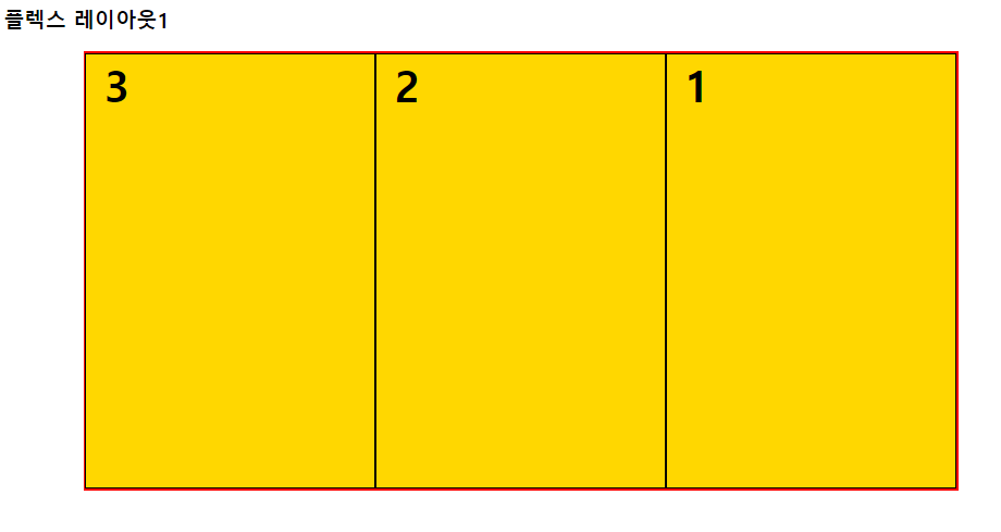 3. display: flex; flex-direction: column;  4. display: flex; flex-direction: column-reverse;  |
- flex-flow: flex-wrap, flex-direction을 한꺼번에 지정할 수 있는 속성
예) flex-flow: row nowrap;
|
<head> <style> #container {
width: 1000px;
height: 500px;
margin: 0 auto;
border: 3px solid red;
display: flex;
flex-flow: row-reverse nowrap;
}
#container > div {
width: 400px;
border: 1px solid black;
background-color: gold;
}
span {
font-size: 50px;
font-weight: bold;
padding: 20px;
}
</style>
</head> <body>
<h2>플렉스 레이아웃1</h2>
<div id="container">
<div id="box1"><span>1</span></div>
<div id="box2"><span>2</span></div>
<div id="box3"><span>3</span></div>
</div>
</body>
|
display: flex; flex-flow: row-reverse nowrap;  |
3.justify-content
수평 방향 정렬 방식을 설정
- justify-content: flex 요소의 수평 방향 정렬 방식을 설정
flex-start: 기본값. 앞쪽에서부터 배치
flex-end: 뒤쪽에서부터 배치
flex-center: 가운데 배치
space-between: 요소들 사이에 여유 공간을 두고 배치(앞뒤 양쪽에 요소를 붙임)
space-around: 요소들 사이에 여유 공간을 두고 배치(앞뒤 약간의 공간을 둠)
|
<head> <style> .wrapper {
width: 500px;
height: 200px;
margin: 0 auto;
border: 3px solid red;
}
.wrapper > div {
width: 50px;
border: 2px solid black;
background-color: gold;
}
#container {
display: flex;
/*justify-content: flex-start;*/ /*기본값*/
/*justify-content: flex-end;*/
/*justify-content: center;*/
/*justify-content: space-around;*/
justify-content: space-between;
}
</style>
</head> <body>
<h2>플렉스레이아웃2</h2>
<div id="container" class="wrapper">
<div id="box1">
<p>1</p>
</div>
<div id="box2">
<p>2</p>
</div>
<div id="box3">
<p>3</p>
</div>
<div id="box4">
<p style="font-size: 50px;">4</p>
</div>
<div id="box5">
<p>5</p>
</div>
</div>
</body>
|
1. (기본) display: flex; justify-content : flex-start;  2. display: flex; justify-content : flex-end;  3. display: flex; justify-content : center;  4. display: flex; justify-content : space-around;  5. display: flex; justify-content : space-between;  |
4. align-items
수직방향 정렬 방식을 설정
- align-items: 플렉스 요소의 수직방향 정렬 방식을 설정
stretch: 기본값. 아이템들이 수직축 방향으로 늘어남
flex-start: 요소들이 시작점으로 정렬 center: 요소들이 가운데로 정렬
flex-end: 요소들이 끝으로 정렬
baseline: 요소들이 텍스트 베이스라인 기준으로 정렬
|
<head> <style> .wrapper {
width: 500px;
height: 200px;
margin: 0 auto;
border: 3px solid red;
}
.wrapper > div {
width: 50px;
border: 2px solid black;
background-color: gold;
}
#container {
display: flex;
align-items: stretch; /*기본값*/
align-items: flex-start;
align-items: flex-end;
align-items: baseline;
}
</style>
</head> <body>
<h2>플렉스레이아웃2</h2>
<div id="container" class="wrapper">
<div id="box1">
<p>1</p>
</div>
<div id="box2">
<p>2</p>
</div>
<div id="box3">
<p>3</p>
</div>
<div id="box4">
<p style="font-size: 50px;">4</p>
</div>
<div id="box5">
<p>5</p>
</div>
</div>
</body>
|
1. (기본) display: flex; align-items: stretch;  2. display: flex; align-items: flex-start;  3. display: flex; align-items: flex-end;  4. display: flex; align-items: baseline;  |
- align-self: 플렉스 요소에 수직축으로 다른 align 속성값을 설정
|
<head> <style> .wrapper {
width: 500px;
height: 200px;
margin: 0 auto;
border: 3px solid red;
}
.wrapper > div {
width: 50px;
border: 2px solid black;
background-color: gold;
}
#container {
display: flex;
align-items: flex-start;
}
#box2 { align-self: center;}
</style>
</head> <body>
<h2>플렉스레이아웃2</h2>
<div id="container" class="wrapper">
<div id="box1">
<p>1</p>
</div>
<div id="box2">
<p>2</p>
</div>
<div id="box3">
<p>3</p>
</div>
<div id="box4">
<p style="font-size: 50px;">4</p>
</div>
<div id="box5">
<p>5</p>
</div>
</div>
</body>
|
display: flex; align-items: flex-start; #box2 align-self: center;  |
- order: 플렉스 요소의 순서를 설정
|
<head> <style> .wrapper {
width: 500px;
height: 200px;
margin: 0 auto;
border: 3px solid red;
}
.wrapper > div {
width: 50px;
border: 2px solid black;
background-color: gold;
}
#container {
display: flex;
align-items: flex-start;
}
#box1 { order: 4;}
#box2 { order: 1;}
#box3 { order: 5;}
#box4 { order: 2;}
#box5 { order: 3;}
</style>
</head> <body>
<h2>플렉스레이아웃2</h2>
<div id="container" class="wrapper">
<div id="box1">
<p>1</p>
</div>
<div id="box2">
<p>2</p>
</div>
<div id="box3">
<p>3</p>
</div>
<div id="box4">
<p style="font-size: 50px;">4</p>
</div>
<div id="box5">
<p>5</p>
</div>
</div>
</body>
|
display: flex; align-items: flex-start; #box2 order: $;  |
5. align-content
요소들이 두 줄 이상 되었을 때 수직방향 정렬 방식을 설정
- align-content:
- 플렉스 요소가 설정된 상태에서 요소들이 두 줄 이상 되었을 때 수직방향 정렬 방식을 설정
- flex-wrap의 값을 wrap으로 설정해야 함
stretch: 기본값. 위, 아래로 늘어남
flex-start: 요소들이 시작점으로 정렬
flex-end: 요소들이 시작점으로 정렬
flex-center: 요소들이 가운데로 정렬
space-around: 요소들 사이에 여유 공간을 두고 배치(앞뒤 약간의 공간을 둠)
space-between: 요소들 사이에 여유 공간을 두고 배치(앞뒤 양쪽에 요소를 붙임)
|
<head> <style> .wrapper {
width: 500px;
height: 200px;
margin: 0 auto;
border: 3px solid red;
}
.wrapper div {
width: 150px;
border: 2px solid black;
background-color: gold;
}
#container {
display: flex;
flex-wrap: wrap;
align-content: stretch;
align-content: flex-start;
align-content: flex-end;
align-content: space-around;
align-content: space-between;
}
</style>
</head> <body>
<h2>플렉스 레이아웃3</h2>
<div id="container" class="wrapper">
<div>
<p>1</p>
</div>
<div>
<p>2</p>
</div>
<div>
<p>3</p>
</div>
<div>
<p>4</p>
</div>
<div>
<p>5</p>
</div>
</div>
</body>
|
1. (기본) display: flex; align-items: flex-start; align-content: strech;  2. display: flex; align-items: flex-start; align-content: flex-start; 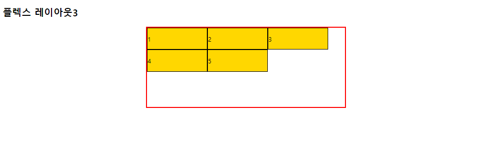 3. display: flex; align-items: flex-start; align-content: flex-end;  4. display: flex; align-items: flex-start; align-content: center;  5. display: flex; align-items: flex-start; align-content: space-around;  6. display: flex; align-items: flex-start; align-content: space-between; 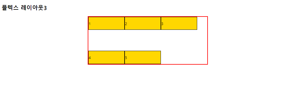 |
'Web > CSS' 카테고리의 다른 글
| 08. CSS 우선순위, Custom Properties (0) | 2024.04.11 |
|---|---|
| 07. 미디어쿼리 (0) | 2024.04.11 |
| 05. CSS 디스플레이, 폼, 포지션 (0) | 2024.04.08 |
| 04. 박스모델 (0) | 2024.04.08 |
| 03. CSS 배경 (0) | 2024.04.08 |


